Mobile Design
Flow Optimisation
Redesigning the End-to-End Mobile Tax Filing Journey
Redesigning the End-to-End Mobile Tax Filing Journey

Student Loan
Student Loan
Student Loan

Car Expenses
Car Expenses
Car Expenses

Workwear Expenses
Workwear Expenses
Workwear Expenses

Tools & Materials
Tools & Materials
Tools & Materials

Pension
Pension
Pension
My Role
Sole Product Designer
Timeline
2024 Q3
Team (Dev & Ops. & Contr.)


+16
About
TaxZap is a Progressive Web App that simplifies the process of preparing and submitting tax filings online currently in Ireland and the UK.
Taxzap is a progressibe web app that helps users easily prepare and submit their tax filings online.
Challenge
The current questionnaire is leading to a significant drop in completion rates, with many users abandoning the process before finishing. This high dropout rate is creating a critical issue, as TaxZap is unable to submit tax filings for a large number of users.
The current user flow is leading to a significant drop in completion rates, with many users abandoning the process before finishing. This high dropout rate is creating a critical issue, as TaxZap is unable to submit tax filings for a large number of users.
Impact
I redesigned the questionnaire flow by incorporating gamification and gesture-based elements to enhance user engagement and motivation. These interactive features guide users through the process, encouraging them to complete all the required tax details accurately.
I redesigned the questionnaire flow by incorporating gamification and gesture-based elements to enhance user engagement and motivation. These interactive features guide users through the process, encouraging them to complete all the required tax details accurately.
TL;DR
Your taxes are done in 60 seconds.
Your taxes are done in 60 seconds.
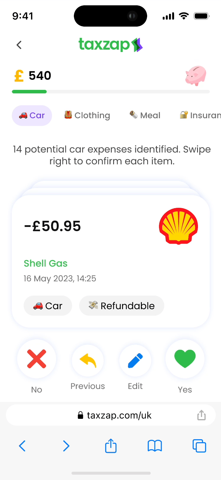
Give it a quick swipe right to confirm.
Give it a quick swipe right to confirm.
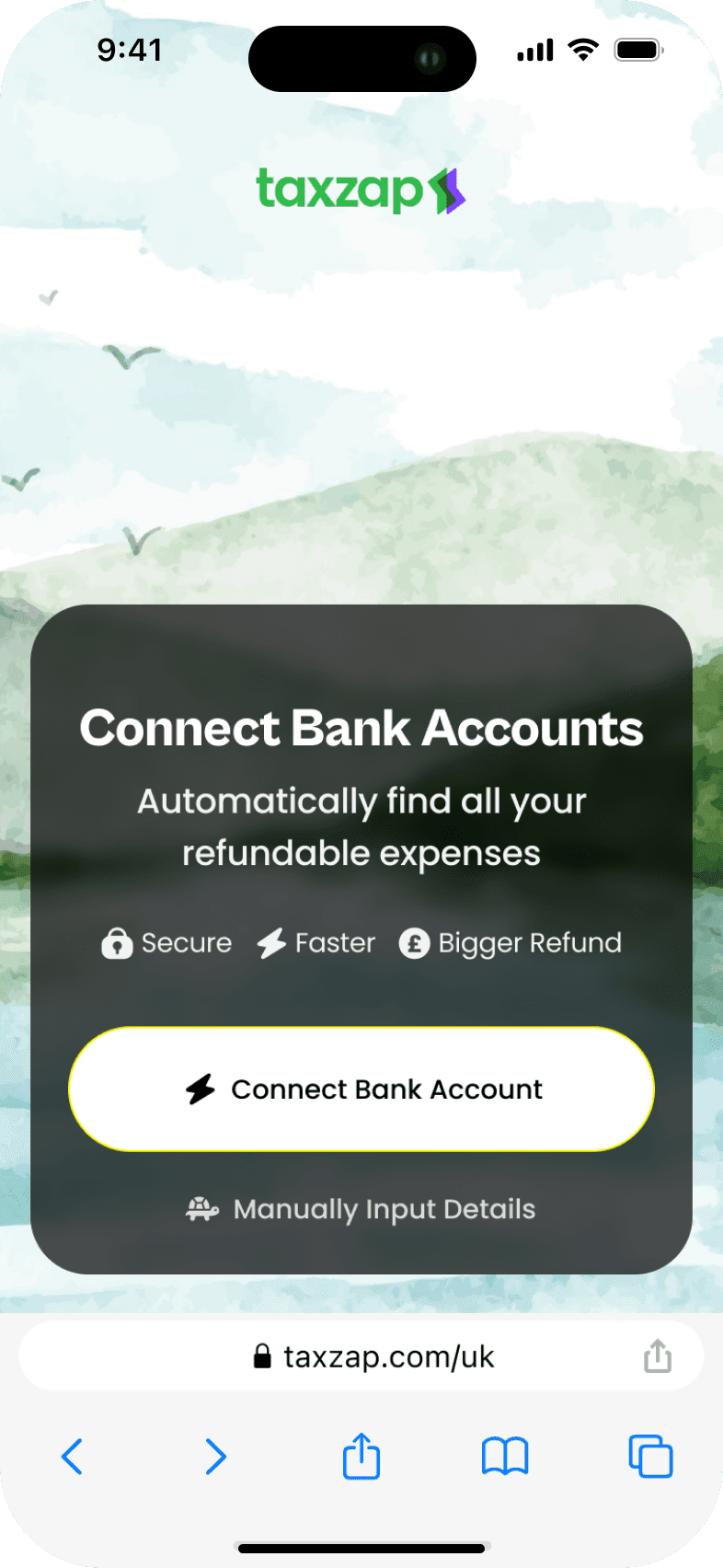
Connect your bank to catch every refundable expense.
Connect your bank to catch every refundable expense.


Before/After
Before/after the redesign
Before/after the redesign
Mobile
Desktop
Before
Story time
Story time
It’s a typical Monday morning when I receive an urgent update: our stakeholders have requested that we gamify our product and integrate an open-banking system. Each task is significant on its own—gamification requires a full redesign of the user experience, while open-banking integration demands precision and security.
It’s a typical Monday morning when I receive an urgent update: our stakeholders have requested that we gamify our product and integrate an open-banking system. Each task is significant on its own—gamification requires a full redesign of the user experience, while open-banking integration demands precision and security.
The challenge is clear, but so is the potential impact. These aren’t just feature updates; they’re opportunities to transform how users interact with our product. Despite the complexity, I’m excited to dive in and start brainstorming solutions.
The challenge is clear, but so is the potential impact. These aren’t just feature updates; they’re opportunities to transform how users interact with our product. Despite the complexity, I’m excited to dive in and start brainstorming solutions.
Before design of the questionnaire

Before version of the questionnaire
Gamification: Good or Bad?
Understanding the behaviors we are trying to drive
Understanding the behaviors we are trying to drive
When asked to gamify our product, I knew I had to tread carefully. Gamification can be powerful, but only if it’s done right. I paused to consider the real behaviors we wanted to drive and the value we needed to deliver, knowing that users would see through any superficial gimmicks.
When asked to gamify our product, I knew I had to tread carefully. Gamification can be powerful, but only if it’s done right. I paused to consider the real behaviors we wanted to drive and the value we needed to deliver, knowing that users would see through any superficial gimmicks.
My focus shifted to understanding user motivations and aligning game elements with genuine outcomes. Instead of just making the product "fun", I aimed to create an experience that truly engages and benefits users, ensuring that gamification added real, lasting value.
My focus shifted to understanding user motivations and aligning game elements with genuine outcomes. Instead of just making the product "fun", I aimed to create an experience that truly engages and benefits users, ensuring that gamification added real, lasting value.

User Flow Analaysis
Mapping the current questionnaire effort
Mapping the current questionnaire effort
I compiled a list of all questionnaire types and mapped out the actions required to complete each question.
This approach helped me address the primary effort required for each action.
This approach helped me address the overall effort required for each action.

Ranking actions by complexity
Ranking actions by complexity
As you can see in the table, the long-form questionnaire demanded significant effort to complete, with many complex question types requiring high cognitive and physical input.
As you can see in the table, the long-form questionnaire demanded significant effort to complete, with many complex question types requiring high cognitive and physical input.
Tapping was the most significant effort, with many input fields adding to the challenge. Open banking was going to automatically extract data from users' accounts and reducing manual inputs, leaving tapping as the primary effort. This shift highlighted tapping as a key area to streamline, presenting a major opportunity to enhance the user experience.
Tapping was the most significant effort, with many input fields adding to the challenge. Open banking was going to automatically extract data from users' accounts and reducing manual inputs, leaving tapping as the primary effort. This shift highlighted tapping as a key area to streamline, presenting a major opportunity to enhance the user experience.

Reducing User Effort
Exploring ways to lighten the user's load
Exploring ways to lighten the user's load

I began by exploring ways to reduce the number of actions in the questionnaire. The first idea was to remove the "Next" button, which users had to click after each question. This change would automatically cut down on the number of taps required, making the process smoother.
I began by exploring ways to reduce the number of actions in the questionnaire. The first idea was to remove the "Next" button, which users had to click after each question. This change would automatically cut down on the number of taps required, making the process smoother.
Another idea was to turn some input questions into single-choice options with pre-set answers, while still allowing users to enter their own responses if needed. However, despite these efforts, the core issue remained—making the experience of answering a long list of questions more engaging and less monotonous.
Another idea was to turn some input questions into single-choice options with pre-set answers, while still allowing users to enter their own responses if needed. However, despite these efforts, the core issue remained—making the experience of answering a long list of questions more engaging and less monotonous.
"Swipe" as the primary gesture instead of tapping
"Swipe" as the primary gesture instead of tapping
A lightbulb went off in my brain: I decided to use "swipe" as the primary gesture instead of tapping. Although "swipe right" is often linked to dating apps, it's an intuitive and natural motion that we use daily. I was inspired by physical card games that involve swiping.
A lightbulb went off in my brain: I decided to use "swipe" as the primary gesture instead of tapping. Although "swipe right" is often linked to dating apps, it's an intuitive and natural motion that we use daily. I was inspired by physical card games that involve swiping.
Advantages of swiping:
Faster and more engaging than tapping a button
Fits well within the thumb zone, making it more accessible
Mimics the real-life action of handling question cards
Delivers immediate psychological rewards and dopamine release with each swipe
Advantages of swiping:
Faster and more engaging than tapping a button
Fits well within the thumb zone, making it more accessible
Mimics the real-life action of handling question cards
Delivers immediate psychological rewards and dopamine release with each swipe

Design Details
Sketching question cards
Sketching question cards
I pitched my idea to the team and stakeholders, and their positive reaction confirmed that I should continue exploring this concept with new designs. After confirming swiping as the primary gesture, I developed low-fi wireframes.
I pitched my idea to the team and stakeholders, and their positive reaction confirmed that I should continue exploring this concept with new designs. After confirming swiping as the primary gesture, I developed low-fi wireframes.
The design features two swipable question types: Yes/No text questions and income/expense confirmations. With open banking, we’d extract users' financial details, and they’d swipe to confirm each transaction, simplifying the experience.
The design features two swipable question types: Yes/No text questions and income/expense confirmations. With open banking, we’d extract users' financial details, and they’d swipe to confirm each transaction, simplifying the experience.

Design details
Design details
I pitched my idea to the team and stakeholders, and their positive reaction confirmed that I should continue exploring this concept with new designs. After confirming swiping as the primary gesture, I developed low-fi wireframes.
I pitched my idea to the team and stakeholders, and their positive reaction confirmed that I should continue exploring this concept with new designs. After confirming swiping as the primary gesture, I developed low-fi wireframes.
The design features two swipable question types: Yes/No text questions and income/expense confirmations. With open banking, we’d extract users' financial details, and they’d swipe to confirm each transaction, simplifying the experience.
The design features two swipable question types: Yes/No text questions and income/expense confirmations. With open banking, we’d extract users' financial details, and they’d swipe to confirm each transaction, simplifying the experience.
#1: Connecting Bank Account

#2: Yes/No Questions

#3: Refundable Expenses Section

#4: Income Details Confirmation

#5: Final

Collaboration
Advocating for design process as a sole designer in a fast-paced startup environment
Advocating for design process as a sole designer in a fast-paced startup environment
As the sole product designer in a fast-paced startup, establishing common ground with your team of developers is crucial for effective collaboration.
As the sole product designer in a fast-paced startup, establishing common ground with your team of developers is crucial for effective collaboration.
We organized a series of workshops with stakeholders and displayed a process proposal on the wall where the product team worked, encouraging ongoing feedback. Additionally, we held discussion sessions with the operations teams to ensure the new designs aligned seamlessly with the tax refund workflow.
We organized a series of workshops with stakeholders and displayed a process proposal on the wall where the product team worked, encouraging ongoing feedback. Additionally, we held discussion sessions with the operations teams to ensure the new designs aligned seamlessly with the tax refund workflow.


Reflection
Learnings after a year at Taxzap
Learnings after a year at Taxzap
Clear communication and alignment within large teams, along with collaboration with other departments like operations and customer support to gain insights into customer pain points and workflows, are key to success.
Clear communication and alignment within large teams, along with collaboration with other departments like operations and customer support to gain insights into customer pain points and workflows, are key to success.
Always think outside the box, but never lose sight of your center—keep users at the heart of your design thinking.
Always think outside the box, but never lose sight of your center—keep users at the heart of your design thinking.
Striking the right balance between development effort and user impact is crucial. Sometimes exceptions are necessary, while other times, the effort outweighs the benefit for minimal impact.
Striking the right balance between development effort and user impact is crucial. Sometimes exceptions are necessary, while other times, the effort outweighs the benefit for minimal impact.
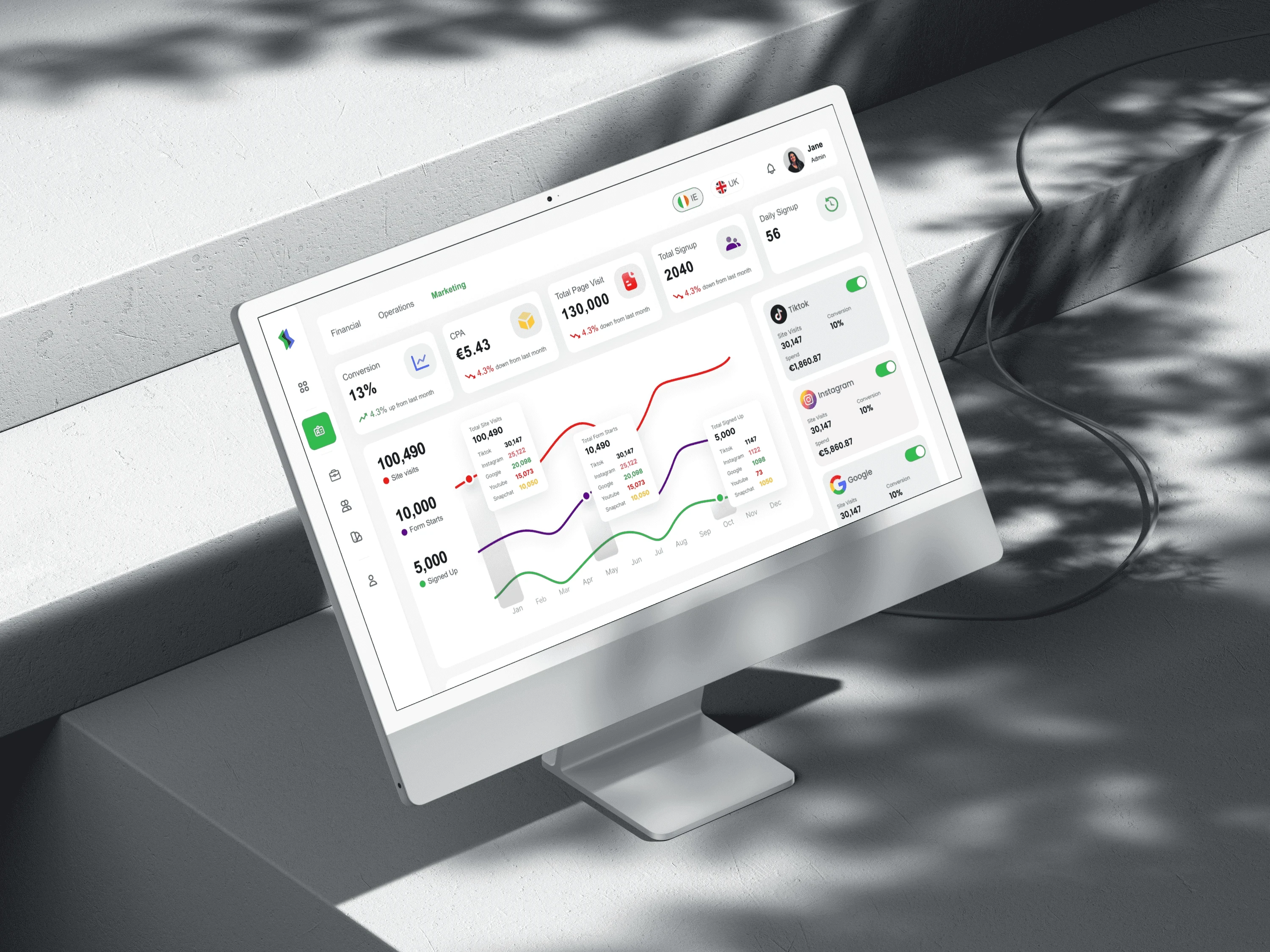
Designing SaaS Tax Management & Automation Platform
Designing SaaS Tax Management & Automation Platform
Designing SaaS Tax Management & Automation Platform